
View Poll Results: Which Pufferfit design do you prefer? (see below for pics)
Design #1


39
66.10%
Design #2


1
1.69%
Design #3


16
27.12%
Design #4


3
5.08%
Voters: 59. You may not vote on this poll
Vote on Pufferfit final design

Thread Starter
|
Member
Joined: Aug 2008
Posts: 935
From: Sudbury, ON, CANADA
Vote on Pufferfit final design
[NOTE: DUE TO CONCERNS OVER COPYRIGHT ISSUES, THE "H" LOGO HAS BEEN REMOVED FROM THE DESIGN. IF THIS IMPACTS YOUR LEVEL OF INTEREST, PLEASE LET US KNOW]
[NOTE #2: THE ACTUAL COLOR CAN BE CHANGED ACCORDING TO YOUR REQUESTS. EVEN A COLOR-LESS (i.e. OUTLINE) VERSION CAN BE PRODUCED. TWO SIZES WILL BE OFFERED, LIKELY A 1" AND A 4-5" SIZE, OR WHATEVER THE GENERAL DEMAND IS FOR. IT'S ALL UP TO YOU, DEPENDING UPON DEMAND]
#1. The original design.
#4. This was our last attempt yesterday.
Basically what has changed the most is the position of the mouth. I'm not sure which one I like best so thought I should get your input
Design #1 (this WILL have grey tires as per the others):

Design #2:
NOW ELIMINATED AS AN OPTION....
Design #3:

Design #4:

[NOTE #2: THE ACTUAL COLOR CAN BE CHANGED ACCORDING TO YOUR REQUESTS. EVEN A COLOR-LESS (i.e. OUTLINE) VERSION CAN BE PRODUCED. TWO SIZES WILL BE OFFERED, LIKELY A 1" AND A 4-5" SIZE, OR WHATEVER THE GENERAL DEMAND IS FOR. IT'S ALL UP TO YOU, DEPENDING UPON DEMAND]
#1. The original design.
#4. This was our last attempt yesterday.
Basically what has changed the most is the position of the mouth. I'm not sure which one I like best so thought I should get your input
Design #1 (this WILL have grey tires as per the others):
Design #2:
NOW ELIMINATED AS AN OPTION....
Design #3:
Design #4:
Last edited by FitCanada_Girl; Oct 24, 2008 at 02:36 PM.

#1 is the original, yes? It looks most like the commercial.
I recognize the issue of the Honda emblem looking like it's being eaten and for this reason I also like #3, with the placement more similar to a nose. However, I think it should resemble the placement on the actual vehicle.
#4 is um... how to say, horrendous? Looks like a beak.
Edit: Oh, and nice mockups Crystal5. Thanks for your work.
Thread Starter
|
Member
Joined: Aug 2008
Posts: 935
From: Sudbury, ON, CANADA
#1 is the original, yes? It looks most like the commercial.
I recognize the issue of the Honda emblem looking like it's being eaten and for this reason I also like #3, with the placement more similar to a nose. However, I think it should resemble the placement on the actual vehicle.
#4 is um... how to say, horrendous? Looks like a beak.
Edit: Oh, and nice mockups Crystal5. Thanks for your work.
I recognize the issue of the Honda emblem looking like it's being eaten and for this reason I also like #3, with the placement more similar to a nose. However, I think it should resemble the placement on the actual vehicle.
#4 is um... how to say, horrendous? Looks like a beak.
Edit: Oh, and nice mockups Crystal5. Thanks for your work.
Yup, #1 is CrystalFiveMT's very first draft. You can see that he added more shading in the spikes in the other designs. If #1 wins
") , it would also get that shading effect. Personally (not to influence anyone), I think it looks like a little spiky bird eating a Honda logo. For that reason, I prefer that segment either to looks more like a hood (making it orange as per image #4) with the H or that the H be moved up as a "nose" (as per image #3 - my personal preference
, it would also get that shading effect. Personally (not to influence anyone), I think it looks like a little spiky bird eating a Honda logo. For that reason, I prefer that segment either to looks more like a hood (making it orange as per image #4) with the H or that the H be moved up as a "nose" (as per image #3 - my personal preference  ). Can't get over the birdy eating an H! Likely just me as most people are showing a preference for that design.
Well, I take full "credit"
 for #4 since I had to convince CrystalFiveMT to do it in the first place. He too had the um, "HORRENDOUS" sentiment. I just thought the segment would look more like a hood and the H on it would be nice. Guess not!

Now, now, FitCanda Girl, let's not try and sway the voters, hehe. We'll have to have a recount!
BTW, if you guys like my work, how bout spreading the love and upping my reps? Just kidding. Kinda.
My thanks to FitCanada Girl for posting these and starting the poll.
I am on vacation starting tomorrow, so worst case is I come up with final design tweaks a week from now. Sorry, but need to get out of L.A. pronto or else I'll end up resembling that pufferfit.
Thread Starter
|
Member
Joined: Aug 2008
Posts: 935
From: Sudbury, ON, CANADA
Now, now, FitCanda Girl, let's not try and sway the voters, hehe. We'll have to have a recount!
BTW, if you guys like my work, how bout spreading the love and upping my reps? Just kidding. Kinda.
My thanks to FitCanada Girl for posting these and starting the poll.
I am on vacation starting tomorrow, so worst case is I come up with final design tweaks a week from now. Sorry, but need to get out of L.A. pronto or else I'll end up resembling that pufferfit.
BTW, if you guys like my work, how bout spreading the love and upping my reps? Just kidding. Kinda.
My thanks to FitCanada Girl for posting these and starting the poll.
I am on vacation starting tomorrow, so worst case is I come up with final design tweaks a week from now. Sorry, but need to get out of L.A. pronto or else I'll end up resembling that pufferfit.
 Oh you're shameless! Look at you working the rep points. If anyone doesn't know, little "friendly" rivalry going on between us for meaninless rep points.
Last edited by FitCanada_Girl; Oct 22, 2008 at 04:24 PM.
Thread Starter
|
Member
Joined: Aug 2008
Posts: 935
From: Sudbury, ON, CANADA
How many days will you be away from this forum again? 6 days is it??? Be afraid, be very afraid....
 I would totally put one of these on my car..but I kinda went sticker crazy already..so yea
 Thread Starter
|
Member
Joined: Aug 2008
Posts: 935
From: Sudbury, ON, CANADA
Imagine it on the gas door! I would so do it. I had gas siphoned out of my little tiny subcompact car (I mean my '09 Fit of course) last week, forcing me to spend cash on a locking gas cap. I am SO "Pufferfitting" my gas door! Bring it on you criminals, bring it on....
New Member
Joined: Oct 2008
Posts: 8
From: Chandler, AZ
My vote is for #1. Now we need to see the "outline" version. As much as I thought the orange was going to be cool, I don't feel like it captures the true color of the OR which is much more a copper color.
Good call on dropping the H logo. It should remove any possible legal obstacle now since the image is just "inspired by" their commerical at this point.
As far as printing goes, has anyone explored cafepress.com as an option?
Thanks for all your hard work CrystalFiveMT. You really captured the spirit of the image from the commercial quite well.
Thread Starter
|
Member
Joined: Aug 2008
Posts: 935
From: Sudbury, ON, CANADA
My vote is for #1. Now we need to see the "outline" version. As much as I thought the orange was going to be cool, I don't feel like it captures the true color of the OR which is much more a copper color.
Good call on dropping the H logo. It should remove any possible legal obstacle now since the image is just "inspired by" their commerical at this point.
As far as printing goes, has anyone explored cafepress.com as an option?
Thanks for all your hard work CrystalFiveMT. You really captured the spirit of the image from the commercial quite well.
Good call on dropping the H logo. It should remove any possible legal obstacle now since the image is just "inspired by" their commerical at this point.
As far as printing goes, has anyone explored cafepress.com as an option?
Thanks for all your hard work CrystalFiveMT. You really captured the spirit of the image from the commercial quite well.
ok, ok. Looks like #1 is going to be the winner BUT this is still open for 1 week since our designer is off on holidays. The outline and any other requests will have to wait until next Wednesday, when CrystalFiveMT is back.
Last edited by FitCanada_Girl; Oct 24, 2008 at 02:37 PM.
Thanks, Shuppie for your compliment.
So we're all on the same clear page, by "outline" we mean, take the orange ones I did and take all colors out. So essentially it will be a white character and the black outline remains.
Is there any interest in an outline version, but colored outline? So if a Milano Red owner wants an outline pufferfit, I can do a similar milano red outline version. (white character)
Oh, and be assured that though I'm on vacation until next Wednesday, things are moving along. I got a quote from a printer and now we have to hammer out payment methods.
I will look at cafepress.com too...
I will look at cafepress.com too...

New Member
Joined: Oct 2008
Posts: 8
From: Chandler, AZ
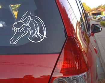
I'm not trying to hijack this project at all, this is just what I pictured when an "outline" version was discussed. This also makes it a color neutral design, if you will, in that it will work on any color paint or on the windows. It would be one color (black, white, silver, etc.) with see-thru areas.
Or not.
I'm thinking like this one from FitDragon's car:

I'm not trying to hijack this project at all, this is just what I pictured when an "outline" version was discussed. This also makes it a color neutral design, if you will, in that it will work on any color paint or on the windows. It would be one color (black, white, silver, etc.) with see-thru areas.
Or not.
Member
Joined: May 2008
Posts: 142
From: Fremont, CA
Mine's a vinyl outline, done up in Illustrator. It turned out nice, the only thing to be careful of is drying the car after a wash... the towel catches on the vinyl.
I like the colored design myself, would be a good contrast to my dragon sticker. It's too bad about removing the "H" logo, though. It really gave the Pufferfit that last Honda touch, differentiating it from a pufferfish. People "in the know" will still get it, though. 
I like the colored design myself, would be a good contrast to my dragon sticker.
It's too bad about removing the "H" logo, though. It really gave the Pufferfit that last Honda touch, differentiating it from a pufferfish. People "in the know" will still get it, though.
Mine's a vinyl outline, done up in Illustrator. It turned out nice, the only thing to be careful of is drying the car after a wash... the towel catches on the vinyl.
I like the colored design myself, would be a good contrast to my dragon sticker. It's too bad about removing the "H" logo, though. It really gave the Pufferfit that last Honda touch, differentiating it from a pufferfish. People "in the know" will still get it, though.
I like the colored design myself, would be a good contrast to my dragon sticker.
It's too bad about removing the "H" logo, though. It really gave the Pufferfit that last Honda touch, differentiating it from a pufferfish. People "in the know" will still get it, though.